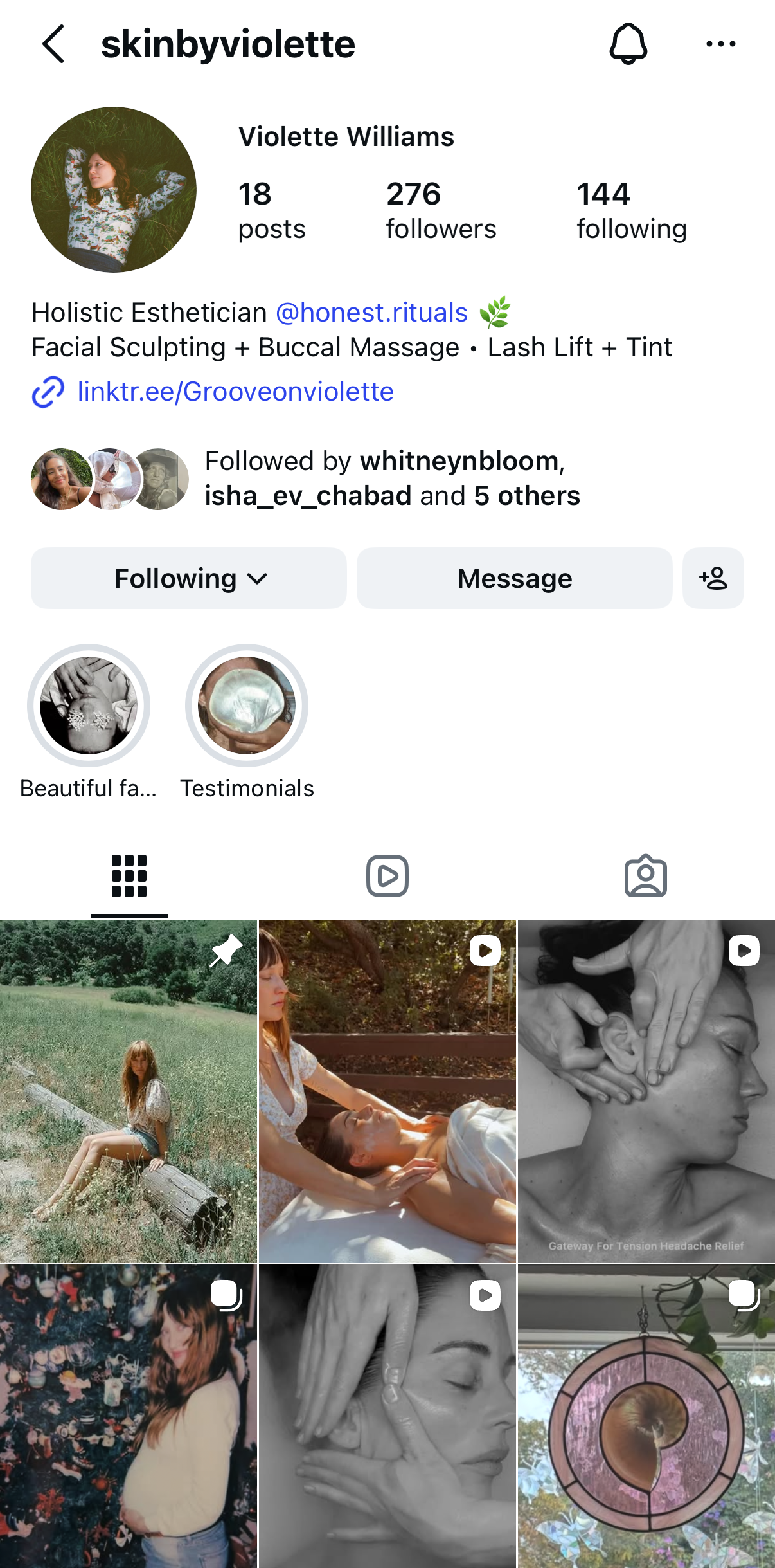
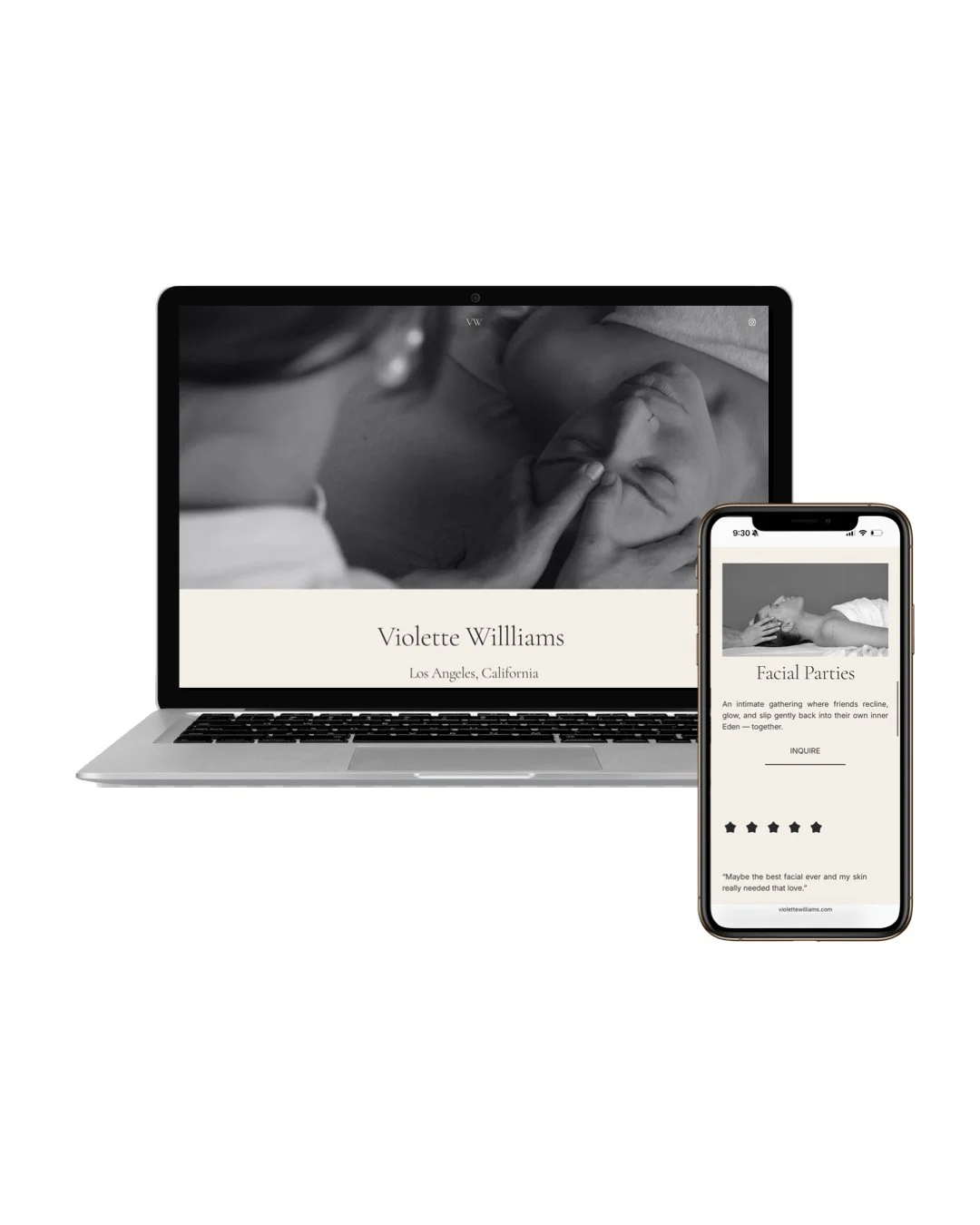
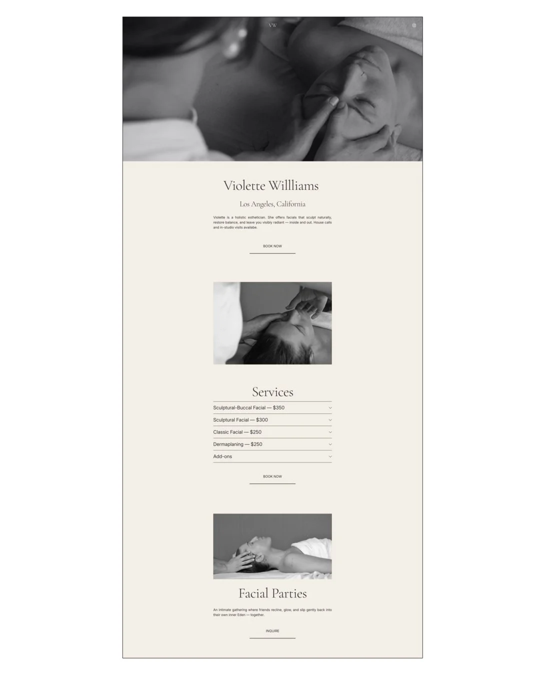
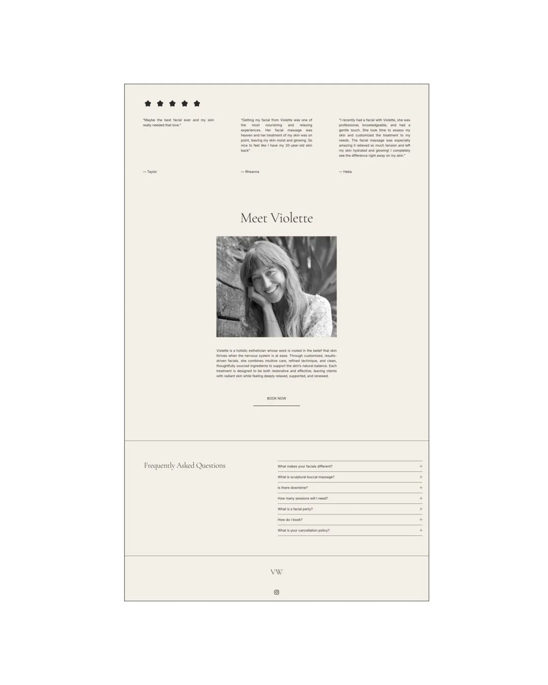
Violette Williams is a holistic aesthetician based in Southern California. We created her landing page during the third trimester of her pregnancy with the intention to set the foundation for her return to work after baby’s arrival.
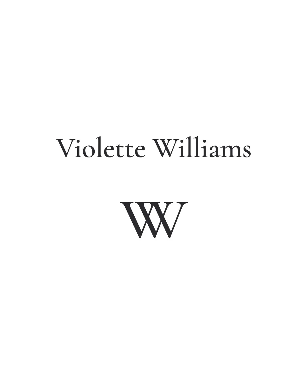
BRAND NAME
One of the very first questions I always ask in the branding process is: what is the name of the brand? In this case, Violette was very clear. The brand is Violette Williams.
BRAND DISCOVERY
The first phase of collaborating involves getting to know my client’s world and help me better understanding their services and the purpose of their website.
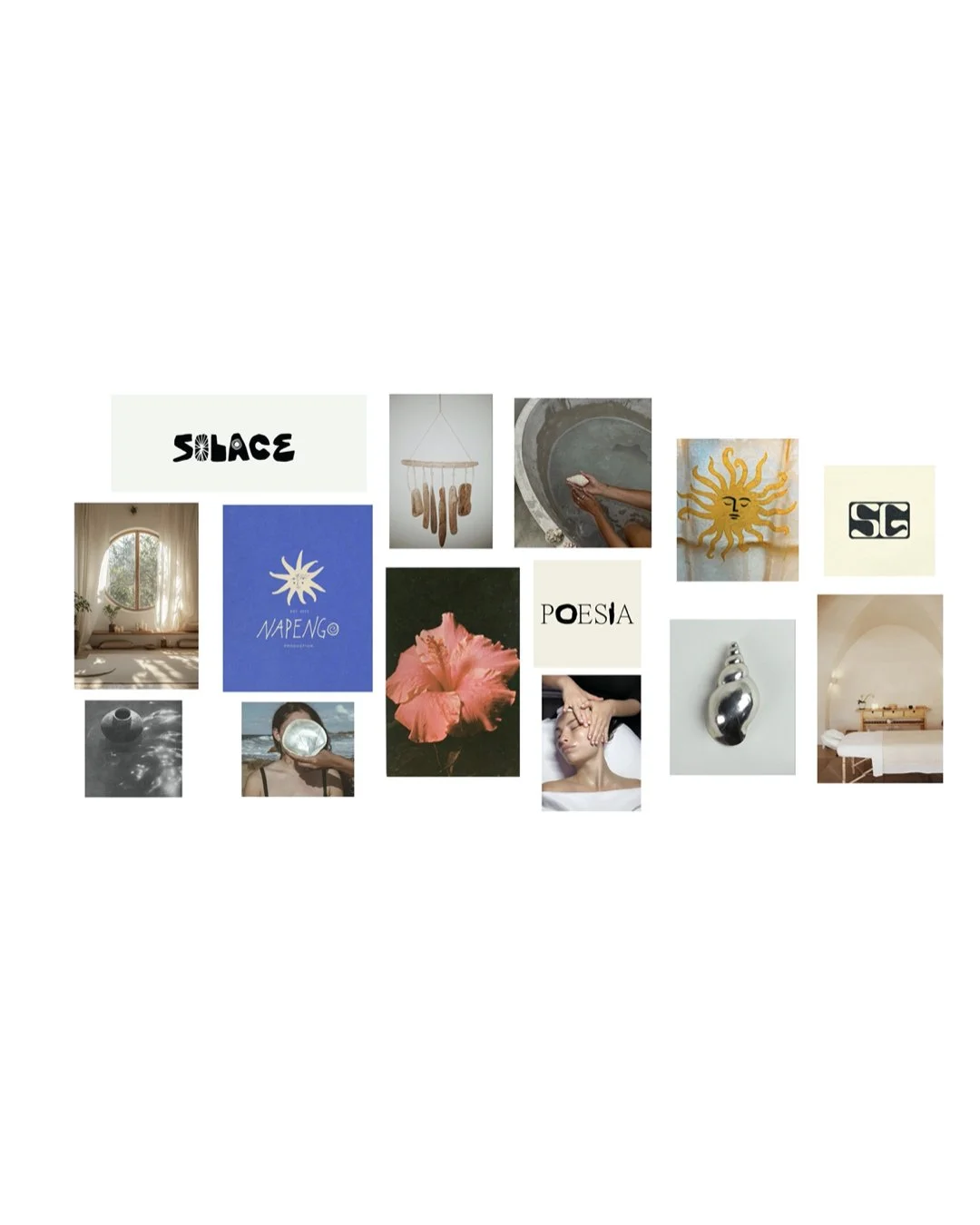
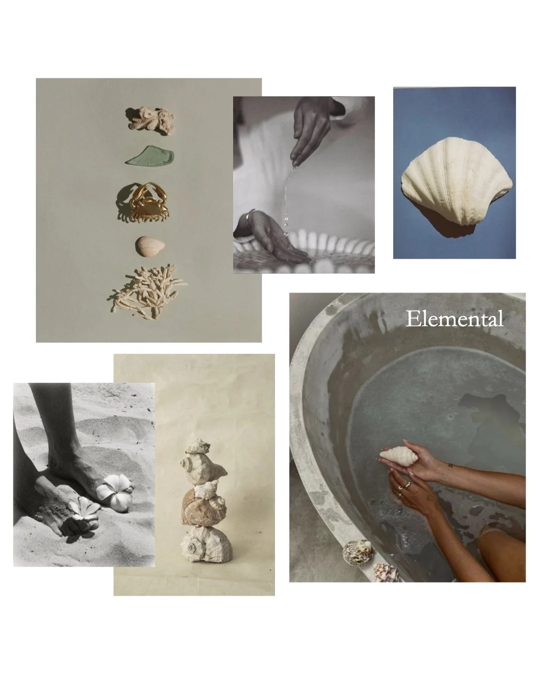
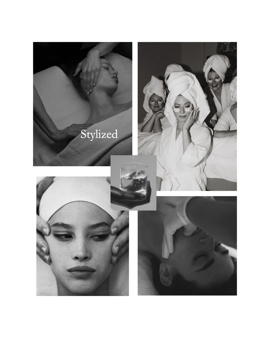
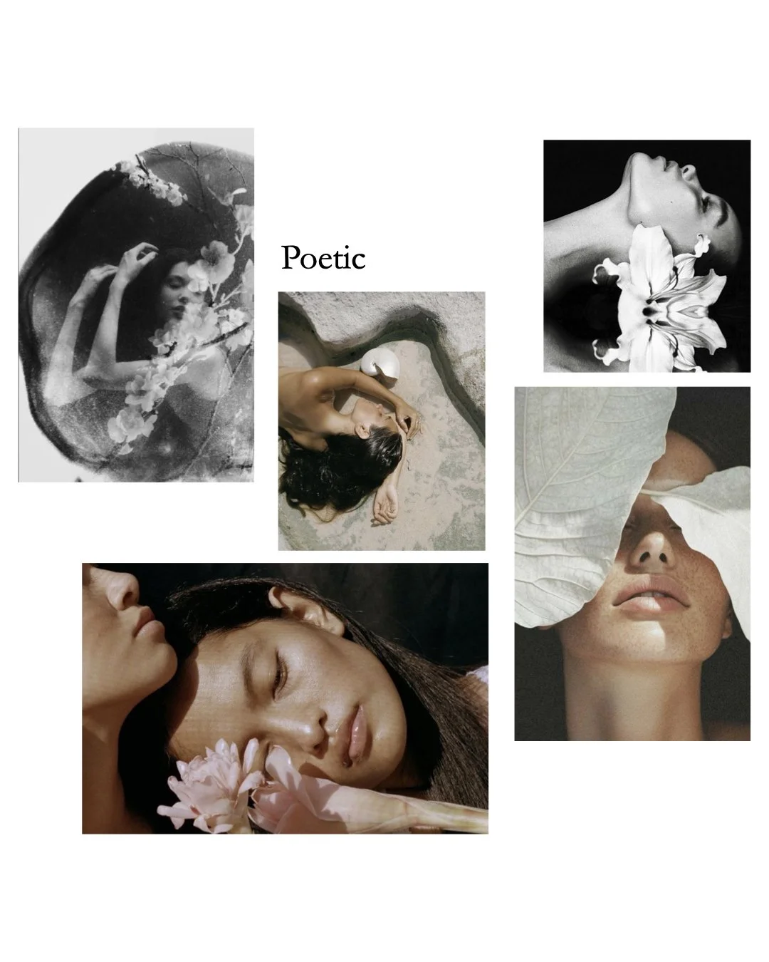
CLIENT MOODBOARD
Violette shared a moodboard representing the visual essence of her brand, at the intersection of softness and depth, light-filled serenity and quiet power.
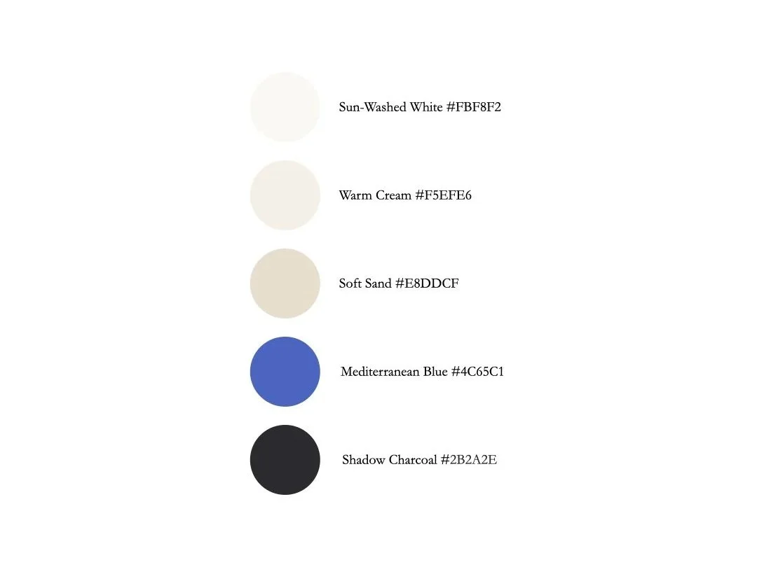
COLOR PALETTE
Inspired from her Libra Rising and Cancer Sun, we icked colors to give her brand a natural feeling of calmness and softness.
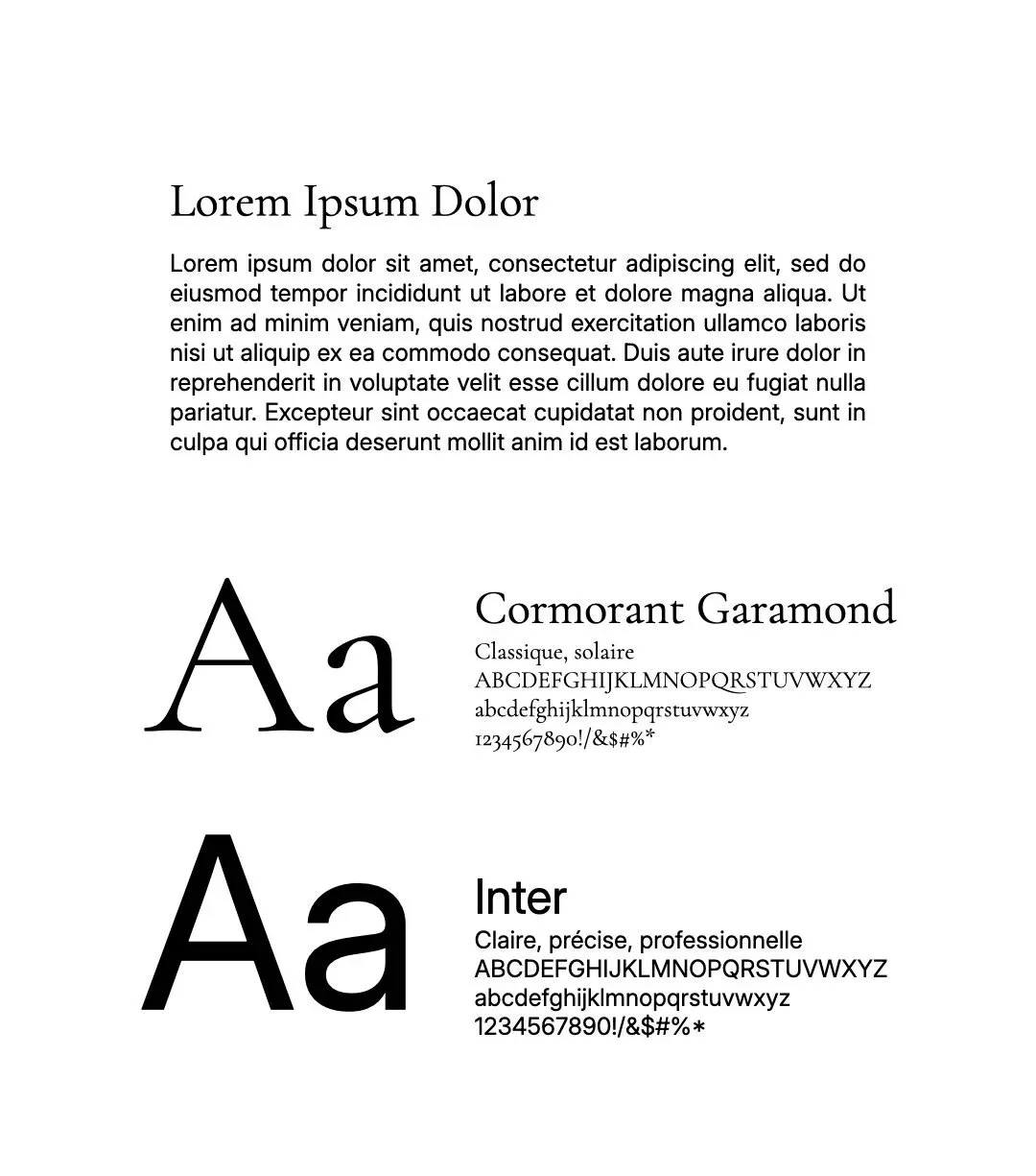
TYPOGRAPHY
We wanted Violette’s font system to feel both poetic and grounded.
LOGO
A simple wordmark and monogram symbol.
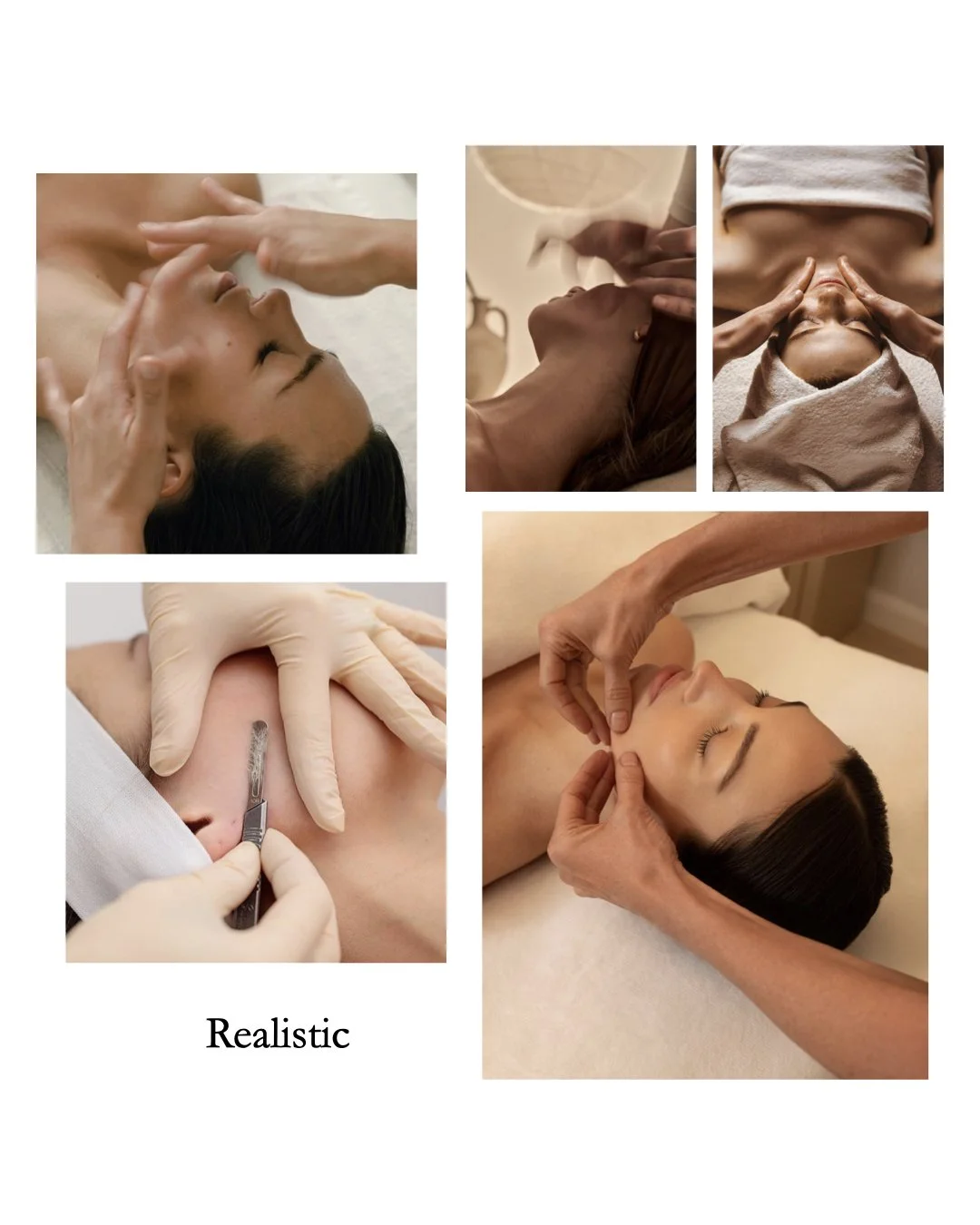
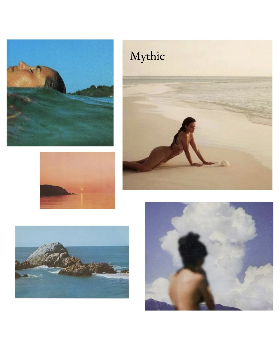
VISUAL TERRITORIES
Five concepts exploring the look and feel of the brand from most literal to most symbolic.
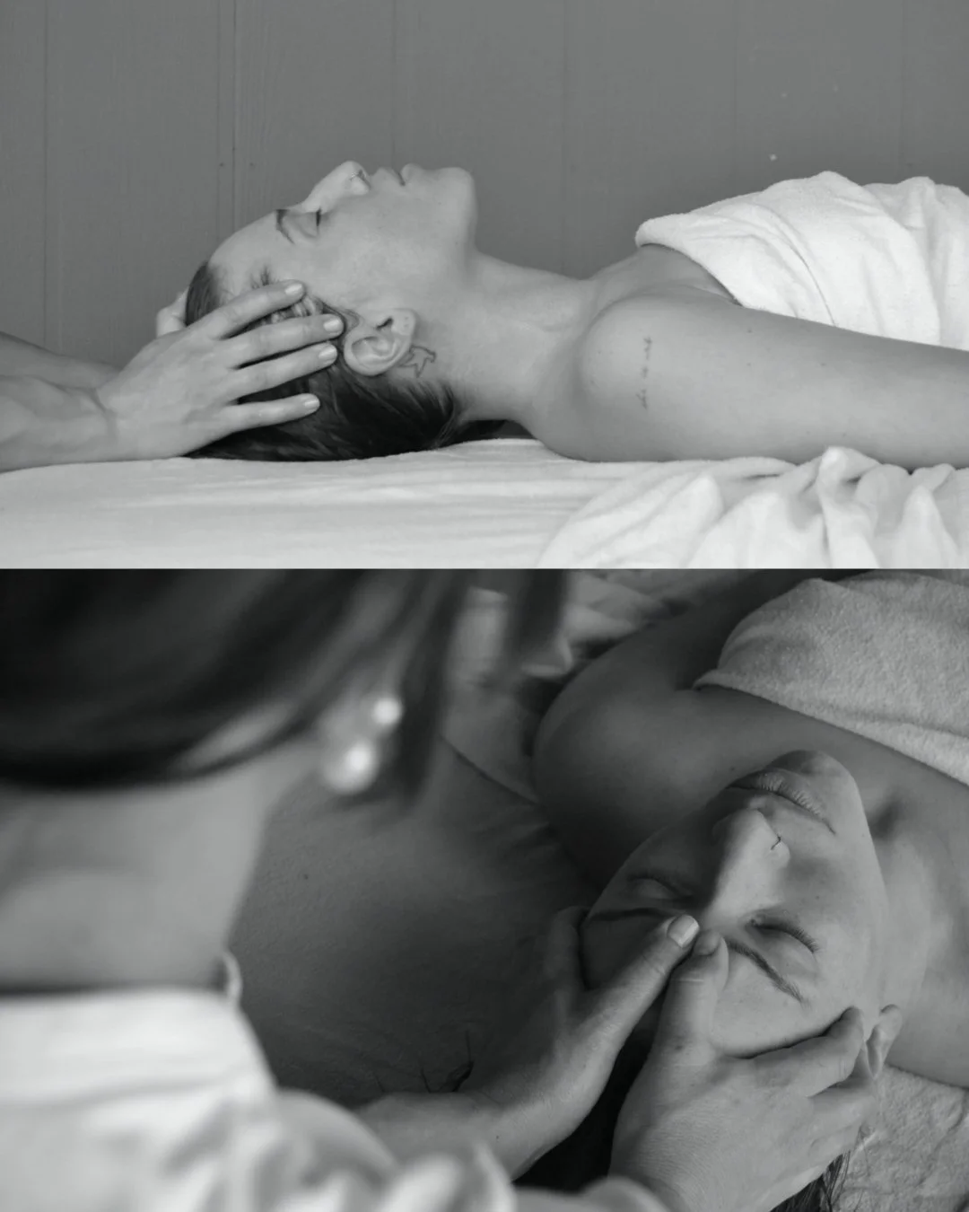
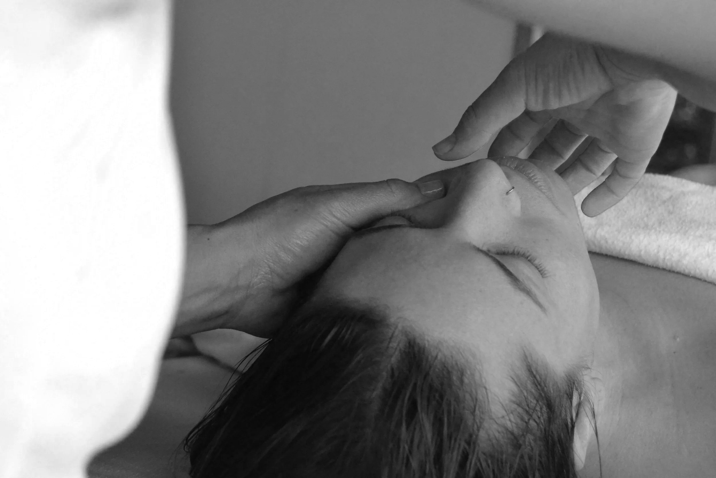
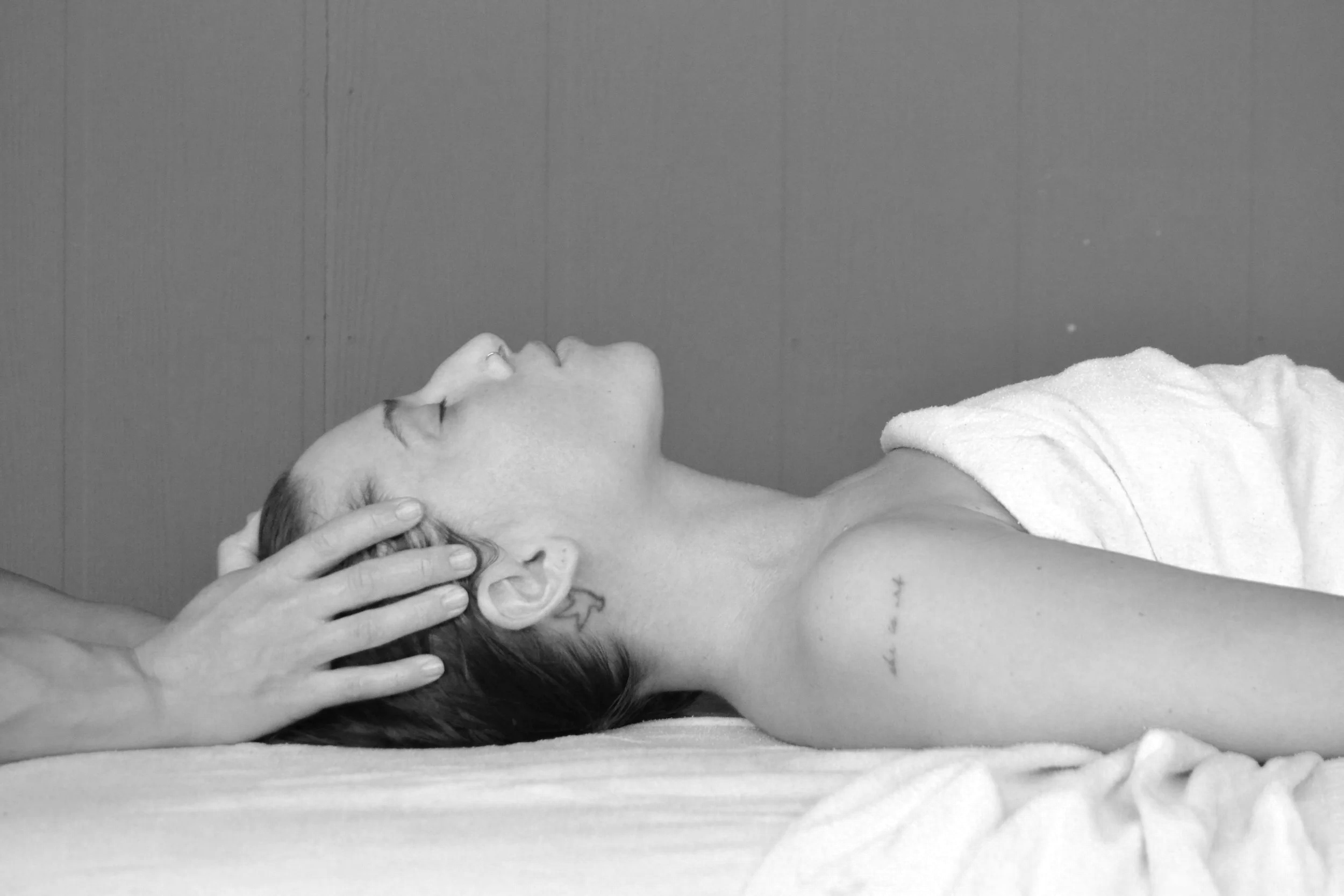
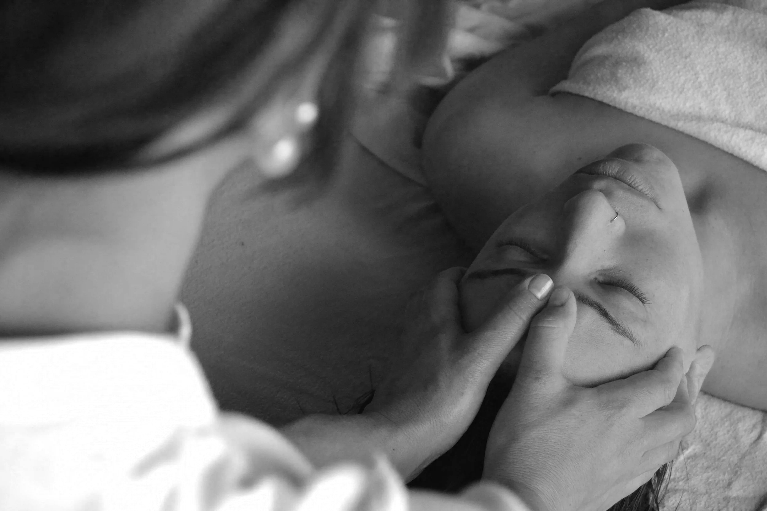
PHOTOGRAPHY
After Violette decided on the timeless black-and-white visual direction, we planned a 2-hour photoshoot so I could capture Violette at work.